 Schedule of Classes
 Maps
Maps Canvas
 Directory
 Library
 LancerPoint
 Calendars
 Bookstore
 Student Email
 News & Events
 Police & Safety
 PCC Connect
 Parking
 COVID-19 Info
Types of Components
Use the resources below to find out more about the types of components that the PCC website uses. For more information on editing component, please see our tutorial.
Call to Actions Grid
The Call to Actions Grid is used to highlight a series of important call to actions. You are able to edit the Call to Action Title, the Sub-text and the URL that the Call to Action is linked to.
Card as Link
The Card as Link is a content container that links to a single URL. It includes options for a header, content, button (link) and background colors.
You are able to edit the header, content, and button text and URL.
Note: The above are examples of 3 of the background colors available for a Card as Link. The Card as Link component on your page(s) may have a different background.
Card With Optional Image
The Card with Optional Image is a content container. It includes options for an image, header, content, button (link) and background colors ( white, red, light gray, and dark gray.)
You are able to edit the header, content, and button text and URL.

Content will appear hear. Content is optional.
Content will appear hear. Content is optional.
Content will appear hear. Content is optional.
This example does not have an image.
Image + Heading Divider
The Image + Heading Divider includes an image and a image with a background color and is used to separate content on a page.
You are able to change the heading text.
Image + Heading Divider
Note: The above is one of the background colors available for a Image + Heading Divider. The Image + Heading Divider component on your page(s) may have a different background color.
Link + Icon
The Link + Icon component is used to display a custom icon after a link. You are able to edit the link text, the URL and the Icon (see the Font Awesome Library for all available icons.)
Examples:
This is a Link + Icon with longer text
Notification
The Notification component functions the same as the Notification snippet. It allows you to notify your users of time-sensitive information. It should be reserved for important announcements and should be turned off when the information is no longer relevant.
Example:
To turn the notification off, open the component and select "Off" under "Display Notification. Click save.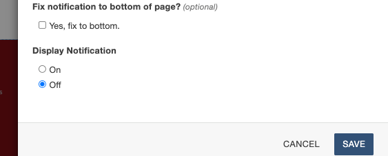
Quicklinks
The Quicklinks component displays a set of important linkseach with a custom icon. The Quicklinks component have options for background colors, text & icon colors, icon labels and URLs for each link. The Icons are from the Font Awesome Library.
Single Step Component
The Single Step component is used for a steps list. Each step is an individual component with options for Step Number, Step color (yellow or red), content, button(s), additional buttons after the content. You will also have the option for the step to be open or closed on Page Load.